
Classical Pilates with Caitlin
Client: Caitlin Clancy, Boston-area pilates instructor
Scope of Work: Graphic design, branding
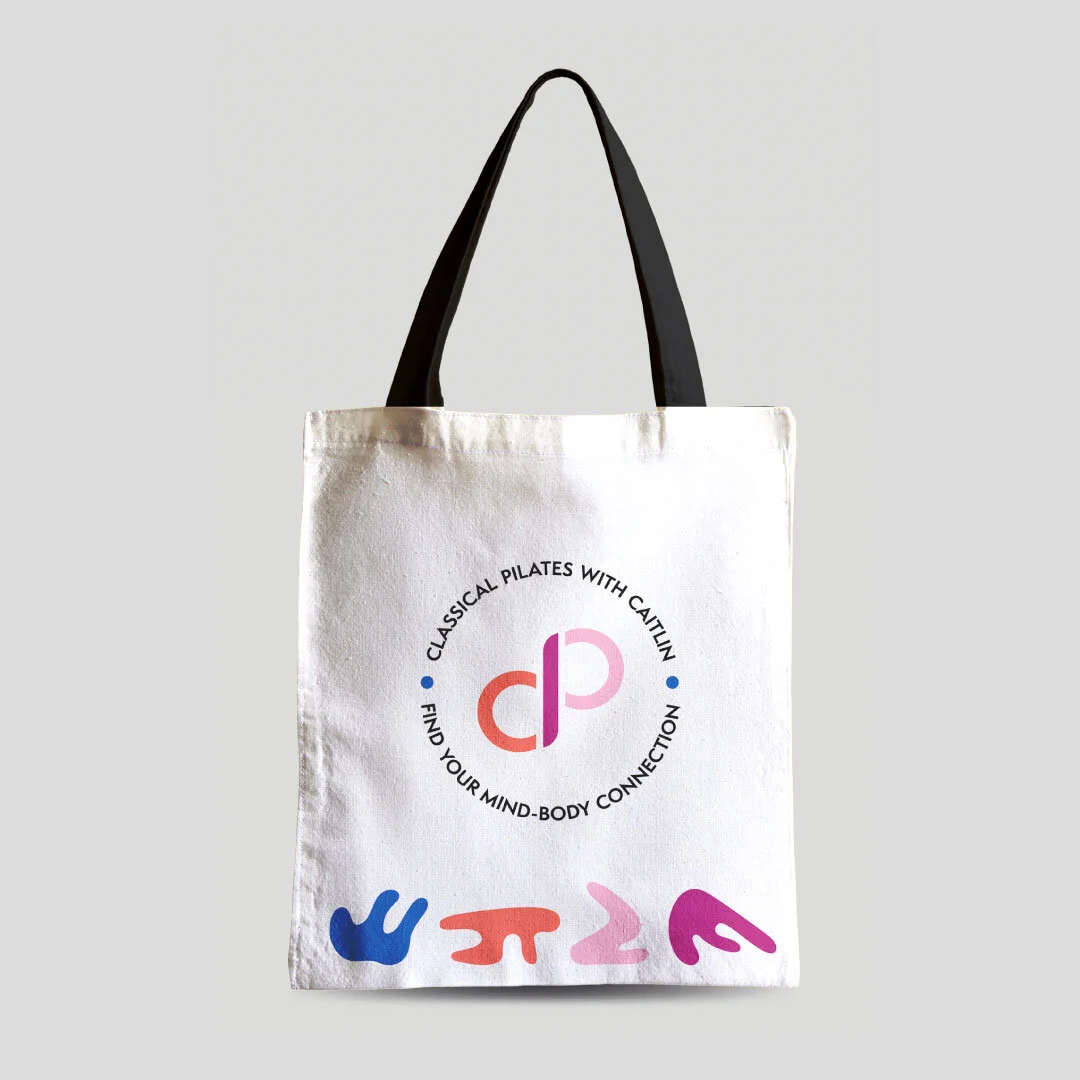
Deliverables: Brand identity, print and digital promotional graphics, merchandise concepts, signage, website template customization
The Brief
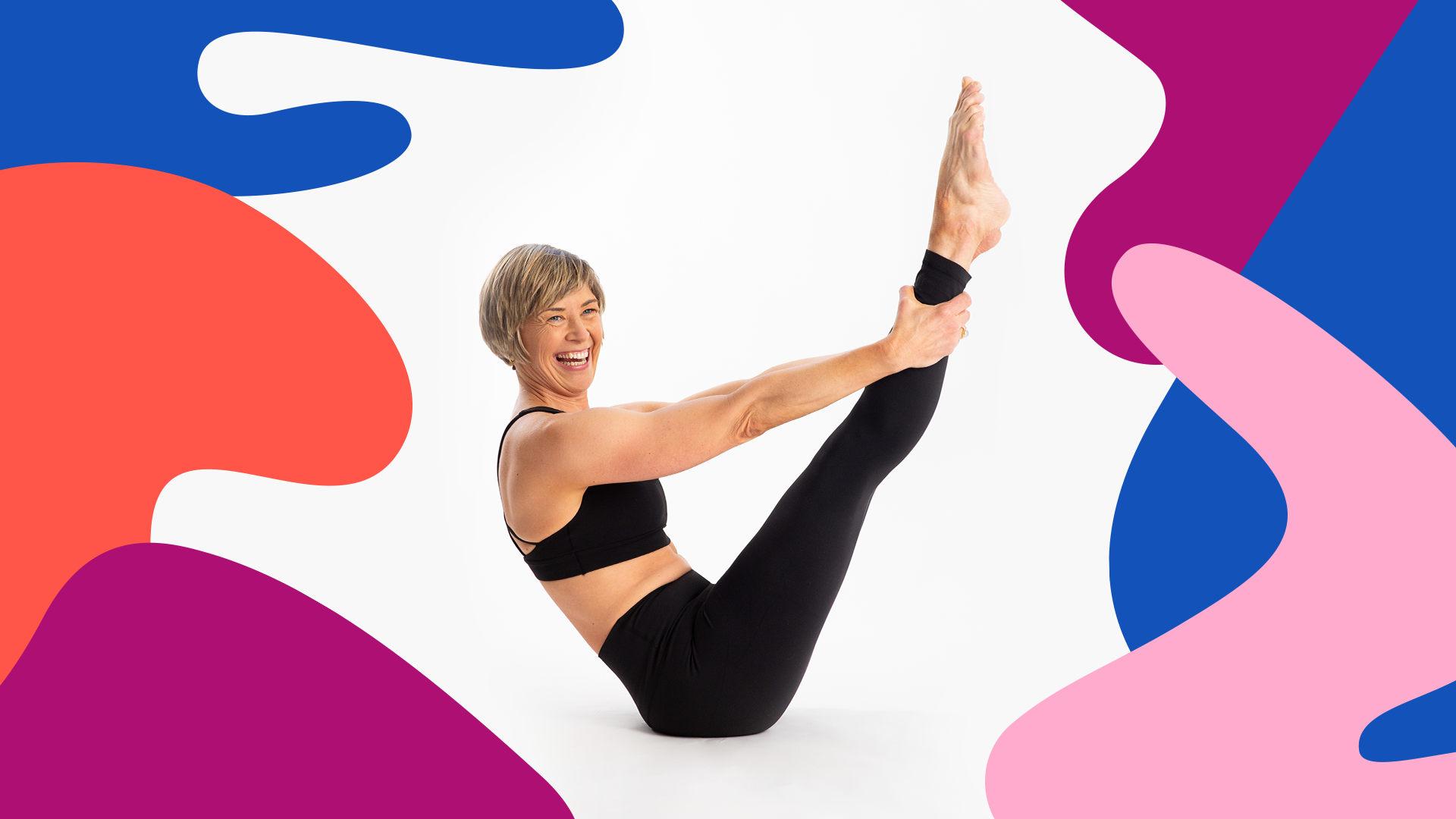
Caitlin wanted her brand identity to be representative of her personality and of her teaching philosophy. The words she uses to describe the core values of her Pilates practice are: compassion, authenticity, humor, joy, discovery, balance, and empowerment. Caitlin described her clients to me, sharing that they are mainly women and that they are mostly beginners—they’re not “fitness buffs” who go to the gym 7 days a week, and they’re not competitive. Her clients find a lot of joy in learning, and they practice Pilates because they want to feel good about their connections to their bodies.
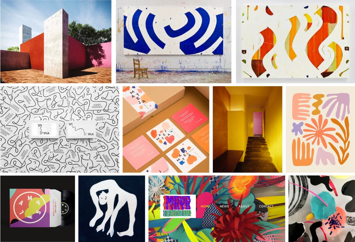
Caitlin and I also share a background working at the Museum of Fine Arts, which made the visual research process a lot of fun! Rather than just focusing on specific brands she likes, Caitlin and I focused our visual research on the work of various fine artists, architects, jewelry makers, etc. that have inspired her over the years. See moodboard exploration below.
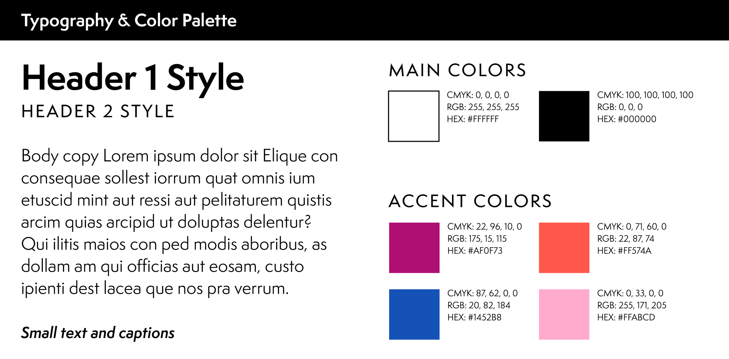
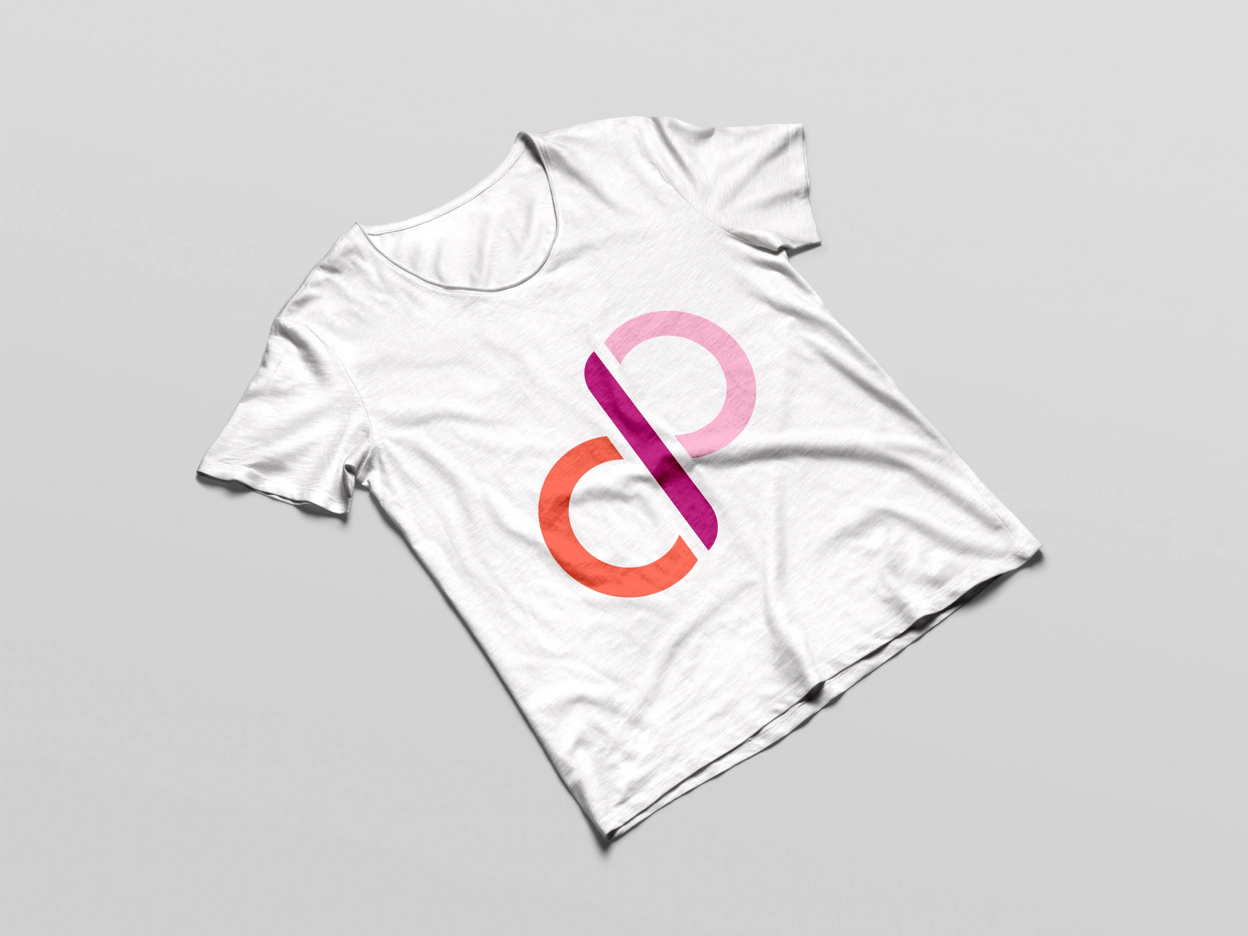
The Solution
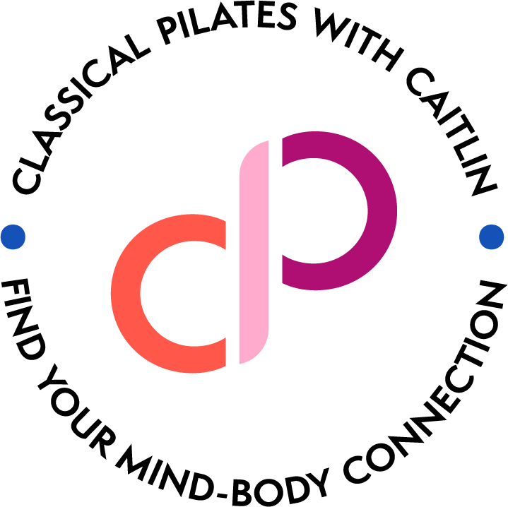
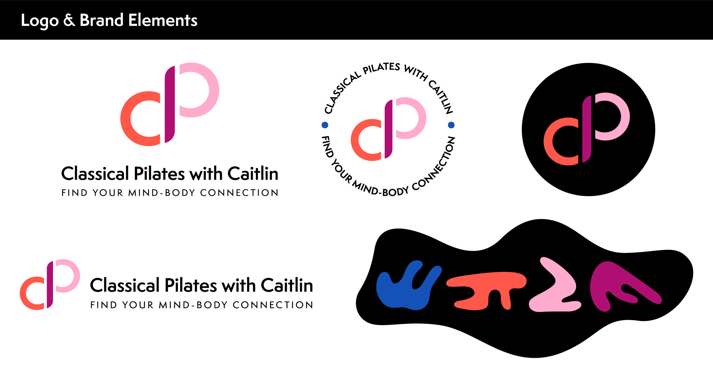
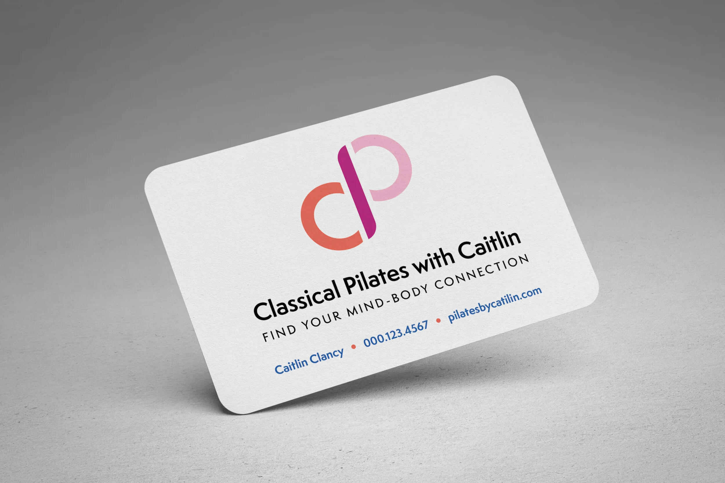
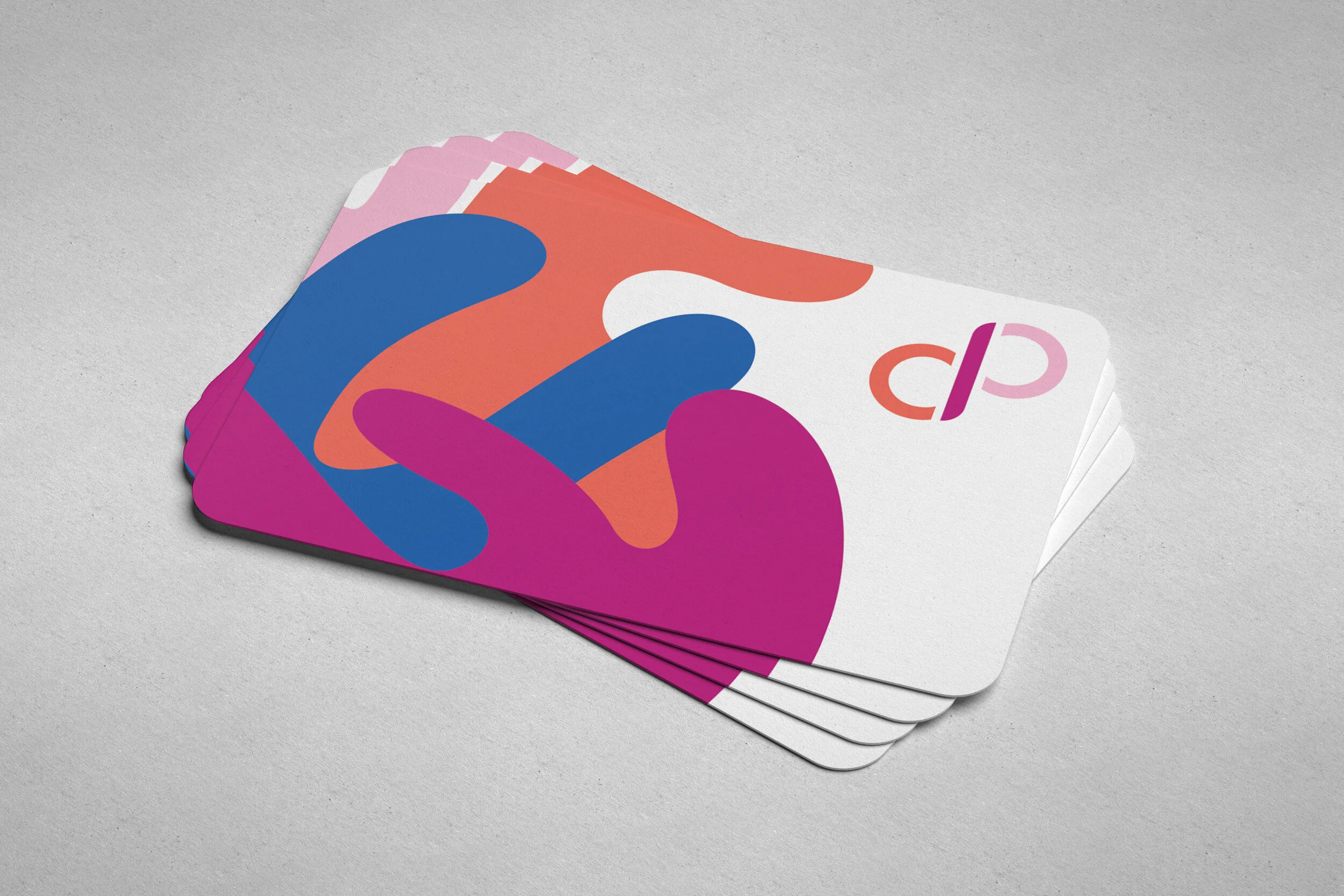
The infinity symbol created by the letters “CPC” (Classical Pilates with Caitlin) implies movement, energy, balance, and growth—all of which are integral to Caitlin’s Pilates practice. In addition to the typographic marks, I included four Matisse-inspired “blobby figures” in the visual identity system. The figures are minimalist, abstract representations of people in different Pilates poses. These bring an element of whimsy and fun to the brand that is totally in line with Caitlin’s personality, teaching style, and fine arts background.
Print and Digital Collateral


To see the full brand identity system in action, visit the Kajabi homepage I helped Caitlin customize.